How to Create More User-Friendly Planning and Reporting Forms

The design of budgeting, planning, and reporting forms is more important than you might think. Users in an organization are more likely to use a solution that is visually appealing and easy to navigate. This shouldn’t be overlooked by solution designers and architects. We have extensive experience designing beautiful budgeting, reporting, and analytics solutions that users love, and we’d like to share some of our top tips that guarantee a user-friendly solution.
1. Mimic the organization’s visual identity
When sketching up an idea of how you want the solution to look, the organization’s visual identity is the most important starting point. Colors, fonts, logo, and other design elements are all important to include—or at least try to mimic—in your financial planning and analytics solution. That way, users will recognize the design and are more likely to adopt the system faster since it will be familiar. If the look and feel of the solution are completely different from the organization’s identity, the adoption and implementation will probably take longer, with the risk of being perceived as a separate entity.
2. Strive for symmetry
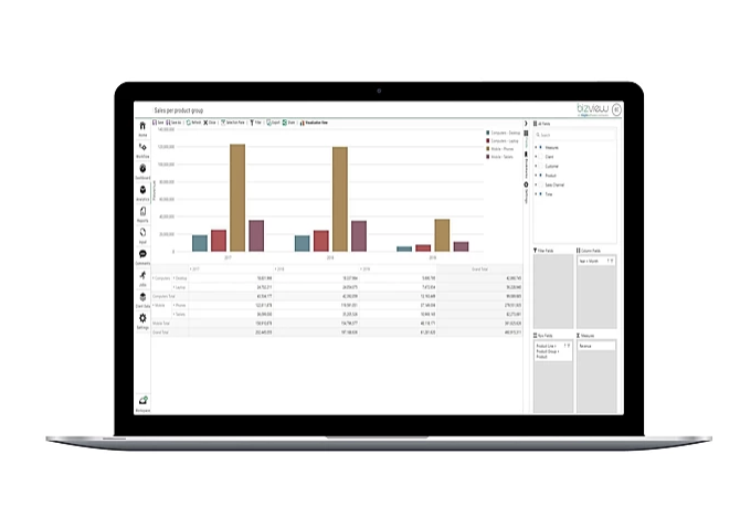
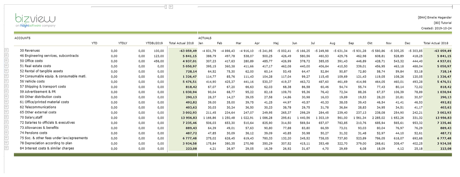
Think about how data will be displayed. For example, if a table is one large grid form, it is important that all cells are equally wide and high, and that the same font and size are used with consistency. Titles and names must fit into cells and should never be partly hidden behind another cell because of too large size. Consistency is key.
3. Keep it simple
If you want your solution to be user-friendly, keeping it simple is your number-one mantra. Try to reduce the amount of data being displayed by using smart features such as View Tags and Column Groupings. With insightsoftware, it is possible to show and hide certain parts of a large sheet by the simple click of a button. By utilizing these capabilities, a very cluttered and somewhat confusing set of information can turn into a simplistic and structured flow of information, completely governed by end-user interaction.
4. Attach instructions for end-users
While a solution might be entirely comprehensible for the designer, it is not guaranteed to be so for end users. Be sure to include instructions, both written and visual. Also, schedule a brief training session during launch to go through the basics (or record a video and distribute to users).
Embrace Continuous Planning To Adapt To Continuous Change
Request Nowinsightsoftware provides software that is flexible enough for organizations to create solutions that perfectly reflect their organizational identity. With a broad graphical and functional toolkit, insightsoftware opens up for creative freedom to create a solution that organizations will love and use.
Interested in better planning, reporting and analytics? Contact us for more information.